Tuesday 18 December 2012

Update on CD cover.


For our CD cover, we have finally used our own images. The above illustrates the raw images inserted into the CD template provided to us.  A few modifications were made towards the two images. we will be posting further updates as we progress


Choosing a Font

For our digipak, we were to select a logo for the band and album title. In order to comply with the conventions that album covers consist of, the band logo may change in order to commemorate the album title.
Here are a few examples of the fonts we have picked and may potentially use.

This font consists of a contrasting border, making it appear to be embossed. This on its own creates aesthetics that do not come off as dull or plain

This font contains a more obvious gothic/alternative impression., which complies with the image of The Pretty Reckless 

Similar to the above, however, in contrast tot he first font, this type of font design may work more towards blending in with the background.

Taken from the same gothic style as the above fonts, this style of font appears to be more plain in contrast to the previous styles, however, still complying with the gothic/alternative image albeit more towards the gothic side.

This font, much like the others also complies with the genre, furthermore, this font is reminiscent of the Relentless brand of energy drinks, which has been a sponsor for alternative music which then significantly associates this particular brand to this type of music.

This font style was taken from a more modern genre. This complies with the genre of our artist, and might be more suitable than the medieval gothic fonts of the above.


Friday 14 December 2012

Completed digipak outside

Here's our finished digipak outside we have made on photoshop using our own images, we will also be creating a design for our digipak inside as well. Our full digipak design (outside and inside) will be completed on the 19th.

Tuesday 11 December 2012

Progress update

Next week on wednesday the 19th is our deadline for our digipak design

Sunday 9 December 2012

Music Video Shoot: 24 November 2012

We shot our narrative music video in a hamlet in Ashbourne, Derbyshire. This section was the flashbacks section of the narrative, where we see the central character kill each of her subsequent boyfriends.
Cellphone signal was barely present and access to a town centre was almost an hour away. Nevertheless, we still had all the necessary equipment and enough supplies to shoot this section of our music video.


The first section was shot in the woods in the hamlet, which was a short walk from the house we were staying and shooting in.
This sequence was the confrontation and retaliation in the woods scene. Here, Kathy, the vocalist shoots the first boyfriend (DAN) in exchange for attempting to do so himself.

Stills and behind the scenes from this scene:


The next sequence is shot indoors. This sequence Chris (2nd Boyfriend) walks in and confronts Kathy in the toilet. With the use of mise-en-scene, we imply that Chris is intoxicated and is has motive to sexually assault Kathy. However, being in his intoxicated state, loses the upper hand and any form of strength, leading to Kathy smashing his face on the edge of a sink and drowning him in it. The sequence required Chris to be drowned after the previous shots were up to standard and up to how we intended them to look like in order to preserve continuity. In the plan of an accidental or premature dunking of Chris's head into the water, we were provided a hair dryer and a towel, both we fortunately only used once.


Music Video shoot: 21st November 2012

We scheduled and shot the performance sections of out music video on Wednesday, 21st November 2012, 3 days before the scheduled narrative shoot in Ashbourne.

The set up went with no hindrance and the shoot went smooth with time to spare (from the room booked time) in the end. The structure consisted of shooting a master shot of the entire song, then moving onto shooting each individual band member playing their part of the entire song. After each individual master shot, at least one bridge and one chorus was re-shot in the above format, and the final chorus, which consists of a majority of perfomance footage, took the most amount of takes to get right.

A few stills from the shoot:


Tuesday 4 December 2012

Editing progress

We've begun editing our shots together using imovie. Once we have the rest of our shots and they are all edited together we will begin syncing it with the music for our video.


Progress update

Our Digi-pak and website design must be finished by 19th December-15 days from now.

Our first full shoot of our video will be finished by the end of this week.

Friday 30 November 2012

Contacting the band

For permission to use the song we have picked, we have contacted the lead singer Taylor Momsen via Twitter @taylormomsen and are yet to receive a reply.

Tuesday 27 November 2012

Website Progress


The website for our band has changed quite abit as we now have added a full news/twitter feed with information and updates on the band as well as new song/album alerts, as well this we now have our own images as the main background and have made this images to suit the pretty reckless and imitate their style/appearence to appeal to the fans. In a more recent update we've made our news feed bow and menu transparent to make the background image more prominent.


Progress report 27th november 2012

Deadline for first shoot is exactly one week, we currently have footage of most of the main sequences in our video and will be uploading some stills from our shoot.

Tuesday 20 November 2012

Digi-pak first draft design

Our first digi-pak draft using images found off the internet, we will be using our own images for our final design; this just a mock up.
The images used were not of our own, but instead were used for practice purposes only

Here we have loaded up the template set up for the CD case. Here we have transformed the image of cigarette ash tray to fit into the dimensions of the cd cover frame.

The image is then desaturated, allowing the first step towards coinciding with out genre color scheme.

Now we then added the image of a zippo lighter and blended in a subject's face.
The image of the subject's face was feathered down to blend into the background. The fill value was also changed in order to achieve this.


Although these are not our own images, this was only an example as to what our final digi-pak will look like. This served as both an example as to what we would want to achieve and as a test for what works in terms of aesthetics and compliance with the genre/band image.

Website design progress

Here is our website progress so far, we've begun adding our own images of the band we're using and will be adding our album cover once it's finished.

Website First Draft

This is the first draft of our website home-page, for our actual website we will be using original images of the band who'll be performing in our video. This is also so we can decide our layout for our site and get it ready for when we add our own pictures.

Friday 16 November 2012

PITCH

This is a video of our music video pitch we did to our class, in this pitch we detail the idea's a and plans for our video.

Wednesday 7 November 2012

Website Analysis & Reasearch


We can see this that the band uses a simple colour scheme for their site and a consistent font style throughout except for the band logo and name, making them stand out more.

Digipack Idea(Plan)

Based on the research we did earlier, we believe that our digipacks main image should represent the title of the album either in a clear way or abstract way as this was seen constantly throughout the examples we looked at, as well as this we should stick to darker backgrounds and lighter fonts, or the other way around to make them stand out to the audience making it appropriate to the genre by following the convention that the target audience expect, we also think that we should use a picture of the band or the leader singer(similar to paramore) as the lead singer of the band we have chose is a main attraction of their target audience and to help sell the band more, the mise en scene used will be showing the style of the band through the images,our imagery will be dark to follow the genres conventions.

Digipack Cover Reasearch

For our digi pack idea we have researched the digipaks of other bands in the alternative rock genre so that our own plan will follow the conventions expected by fans of this genre in terms of approptriatness of the digipak to the genre, mise en scene & its meaning/effect, the layout/font and effect, the image and style(how does it sell the band)


This is an example of a digipak from the lost prophets, the font is very bold and both the front and back of the case use dark colours which is a usual convention in the alternative rock genre, as well as the picture of the band on the back which is a recurring theme throughout bands within this genre and both stand out due to their dark colours that the band is wearing/ the colour of the font as there is a white background , the image and style of it is very simple with the main picture being a black eagle and the name of the album is clearly written underneath, the mise en scene used is portraying the bands image clearly and people expect to see certain bands have a certain style and this cover clearly aims to show lost prophets style and attract their fans, the main image also relates to the title as it is a black eagle representing "liberation"


 Another example is from thirty seconds to mars, this cover is very different to that of lost prophets however they also use dark and light colors to contrast each other and make certain things stand out, however there mise en scene is very different seeing as there is no picture of the band but instead of an animal, this also suggests to there fans that this album is for "rebels" with the title also portraying this idea, it is appropriate to the genre as alternative rock is a genre that trys not to be as mainstream as other genres and this is a good example of how there album covers differ to that of other genres by providing strange images rather then just portraying themselves, the same is seen on the front of the lost prophets album
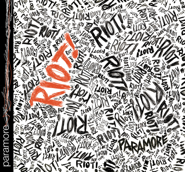


Paramores is a little different to that of 30 seconds to mars and lost prophets however it is still appropriate to the genre and to the idea of attracting those who are not mainstream and more rebellious, its font shows this by being abstract and covering the front cover with the name of the title in different positions really helps to add to this effect, the back of the album continues this effect, however the band is also portrayed on the back, the same as the lost prophets cover, the cover also helps to sell the band by showing there obvious style that the fans have become used to and look for when they release new albums, the image of the band also helps to sell the band by being more shaded then the rest of the cover and making them stand out a lot more, especially with the font on the
Paramore Riot Album Coverback being orange.


 My chemical romance, also use black/dark colours with the main fonts being black and main image with the background being a lighter colour to make them stand out as we have seen throughout the examples and stays appropriate to the genre by again using images related to the title of the album by using a  parader and portraying them in black, the font is similar to that used in the other examples and is clearly used to make titles stand out against the background, the back image also represents the title and follows the genres conventions of dark imagery and ones that usually relate to the title if there is not a picture of the band, this also relates to the bands image as MCR are usually wearing similar colours to that on the covers


 Linkin parks covers also use black and white, with the background being black and the font being white again making them stand out, as well as this the mise en scene used is the man spraying graffiti and again follows this recurring idea of rebellious behaviour in the alternative rock genre, and attracting there fans as they expect there lyrics to help them relate to this type of behaviour,the back also uses white and black fonts and shows an image not of the band but of something they use during making there music